IELTS Report, topic: Double line graph of lengths of hospital stay (from IELTS High Scorer’s Choice series, Academic Set 4)
This is a model response to a Writing Task 1 topic from High Scorer’s Choice IELTS Practice Tests book series (reprinted with permission). This answer is close to IELTS Band 9.
Set 4 Academic book, Practice Test 17
Writing Task 1
You should spend about 20 minutes on this task.
The graph below shows the average length of stay last year (in days) for serious injuries for different age groups in private and public hospitals in Queensland, Australia.
Summarise the information by selecting and reporting the main features, and make comparisons where relevant.
You should write at least 150 words.
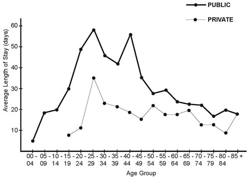
Last Year’s Average Length of Stay at Private and Public Hospitals for Serious Injuries – Queensland, Australia

Sample Band 9 Report
The graph provides two sets of statistics regarding the differing lengths of stays last year for patients with serious injuries in private and public hospitals in Queensland, Australia. The information is given for age groups for every four years of age.
Overall, it is clear that last year public hospitals stays were longer than stays at private hospitals across all age groups, with only one exception. The average lengths of stay were, however, very similar in trend in terms of how the stays rose and dropped.
The figures for public hospitals begin for the age group zero to four years. The lengths of stay go up very sharply and steadily from this age group, starting at around four days up to just under sixty days for the age group twenty-five to twenty-nine. There is then a sharp and steady drop to just over forty days to the age group thirty-five to thirty-nine. There is a more sharp increase to approximately fifty-seven days for the next age group and then there is a decrease in the length of hospital stays. This drop is sharp to start with, but slows down from the age group fifty to fifty-four years (around twenty-seven days) to eighty-five years plus (around eighteen days).
The figures for private hospitals follow a similar trend. The figures begin with the age group fifteen to nineteen years. They show a rise to a peak at the age group twenty-five to twenty-nine, the same peak age group for public hospitals. There is then a mostly steady drop in the length of hospital stay until the eighty-five years age group, where the length of stay is the same as the stay at public hospitals (around eighteen days). This is the only average length of stay that is the same for the public and private hospitals. The average length of stay is always larger in the age groups at public hospitals.
Go here for more IELTS Band 9 Reports