This report was written by a student on a topic from IELTS High Scorer’s Choice series, Academic Set 1 book (page 97, reprinted with permission).
You should spend about 20 minutes on this task
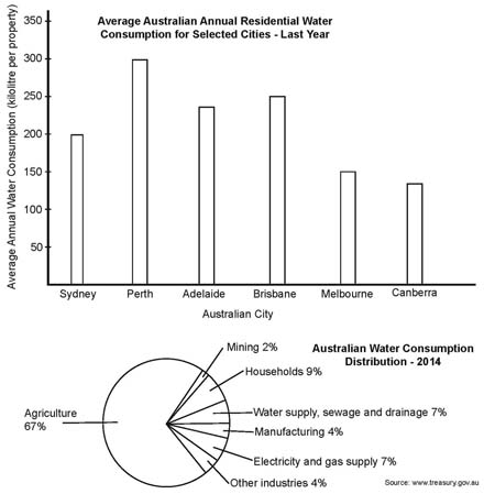
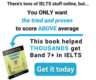
The bar chart below shows the average Australian water consumption in selected cities for last year. The pie chart shows the distribution of Australian water consumption for last year.
Summarise the information by selecting and reporting the main features, and make comparisons where relevant.
Write at least 150 words
Answer
The bar chart illustrates the average Australian water use in 6 selected cities for last year, while the pie chart describes the share of water each industry consumed in 2014.
Overall, Perth had the highest average water use for last year with 300 kilolitres per property, followed by Adelaide and Brisbane with 240 and 250 kilolitres property respectively. On the other hand, Melbourne and Canberra showed the lowest average water consumption of 150 and 140 kilolitres respectively.
Taking a look at the distribution of water use by industries, we can clearly see that Agriculture took over two thirds of the entire consumption , followed by households . Water Supply, Sewage and Drainage industry consumed the same amount of water as the Electricity sector, 7%. In the same way there was no difference between the consumption of Manufacturing and Other industries, with both sectors using 4% of the national water supply. The smallest user was the Mining industry, accounting for just 2% of Australian water use.
To conclude, the city of Perth and the Agriculture industry had a major impact on the usage of Australian water.
The information on two charts was covered in this well-developed response. The data was grouped correctly and a wide range of vocabulary and sentence structures was used. The minor grammatical mistakes (mouse over words underlined in blue shows the corrections) could have been caught at the final proofreading stage. Overall, this report seems worthy of Band 8.
Click here to see more IELTS reports of band 8
Its really helpful
Informative and expressive
Thank you! I’m glad this helps.