You should spend about 20 minutes on this task.
The graph below compares the changes in the birth rates of China and the USA between 1920 and 2000.
Summarise the information by selecting and reporting the main features and make comparisons where relevant.
Write at least 150 words.
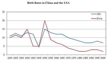

The graph some striking similarities between the Chinese and the US birth rates from 1920 to 2000. Both countries experienced considerable fluctuations in the similar period with during the 1940s and during the .
The birth rates in China rose from 10% in 1920 to 15% in 1935. Later, the figure plunged to a low of 5% in the 1940s and was followed by an exponential growth to the peak of 20% in 1950. Next, the fertility rate dropped sharply to 8% in the following five years. Finally, the figure declined gradually to 3% during the latter half of the century.
Meanwhile, the US had similar birth rate of 12% to that of China in 1920. The figure fluctuated in between 12% and 14% during 1920s and 1930s until it hit a low of 4% in 1945. Five years later, the birth rate reached a peak at 15% in 1950 but it made a steady fall to the final figure of around 7% in 2000.
This report covers the requirements of the task. The main trends / features were sufficiently developed. The candidate has arranged ideas coherently, though the use of linking words can be improved. The range of vocabulary is adequate. There are a few errors in grammar and word choice, and one instance of inaccurate data. Overall, the task response meets the expectations and seems good enough to achieve Band 7.
Click here to see more IELTS reports of band 7
The WW2 occurred during the 1940s when both countries\’ ratings dropped, but shall I not mention about the WW2 because it has no confirmation with the fall?
Hi Taizo, this is an excellent question! It’s not a good idea to speculate regarding the cause for the drop in ratings, if WW2 isn’t mentioned in the information presented to you in task statement, you don’t need to write about it in the report.
The graph demonstrates substitutions of the birth quotations of China and the USA between 1920 and 2000. Overall, there are too many changes in both countries about these rates for 80years.
Birth rates were more than 10%. And by the year 2000 directory of rate rapidly decreased. For 5-8 years it increased from 10% to 14-15% . From the years 1940s to 1945s the World War II happened. The result of this, many people died in the war, that is why line remained stable. But after the war, the graph rised sharply, that is, the birth grew. After 1953s in both countries rate of birth fell rapidly. In the USA it approximately went down about 7 or 8percent, but in China this number is more than 15. In 1953s China’s graph of rate was higher than USA’s, but after 50years USA’s rate of birth is more and its line is also higher.