You should spend about 20 minutes on this task.
The graphs below show unemployment rates and average earnings according to level of education.
Summarise the information by selecting and reporting the main features and make comparisons where relevant.
Write at least 150 words.

Unemployment and Average Earnings by Educational Level 2016
Answer
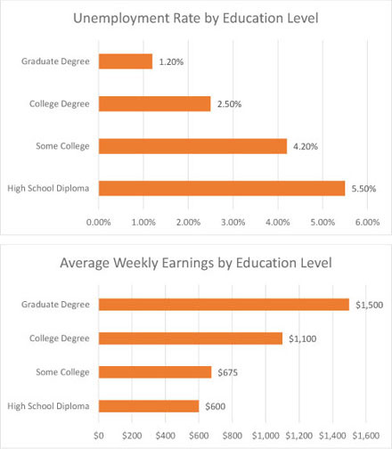
Two bar graphs describe the data from 2016 regarding the percentage of unemployed and average weekly income by different levels of education.
The first graph shows unemployment rates in 2016 in four different groups. Looking at people who only completed high school we can see that 5.5% were out of work. It is evident that the percentage of unemployed gradually decreased as the level of education rose. The proportion of unemployed was the lowest among those with a graduate degree, at only 1.2%
The second chart is showing the relationship between education level and weekly earnings. Those with only high school diplomas earned the least amount of money per week ($600). People who studied at college for some time earned a slightly higher amount of $675 per week, but college or graduate degrees owners overtook them by earning $1,100 and $1,500 a week, respectively.
All in all, it can be seen that people with higher level of education are more likely to have a job and higher income.
Click here to see more IELTS reports of band 7