Skip to content

ielts samples

IELTS Report, topic: bar graph of water usage

You are advised to spend a maximum of 20 minutes on this task.

The graph below shows the annual water usage (in millions of cubic meters) by industries in Somecountry. Write a report for a university tutor describing the information shown.

You should write at least 150 words.

Water usage bar-graph

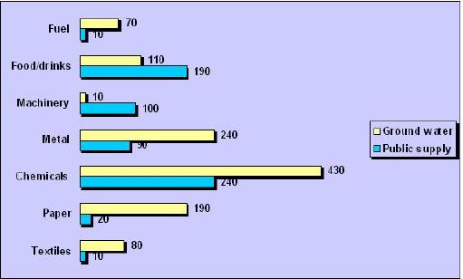
The describes the water usage for every year in Somecountry in millions of cubic meters.

usage shown by two , ground water and public supply. Fuel and textiles are the ones that use the least water, 10 of public supply and of ground water. Machinery just the opposite of these two and 10 of ground water and 100 of public supply.

Food/drinks, metal, paper and chemicals over 100 of ground water where chemicals peaks at 430. The highest figure of water usage of public supply also belongs to chemicals (240). Next on the list is food/drinks with 190, the others are under 100.

Overall, the chemical industry uses a lot more water than the rest of the industries in terms of both ground water and public supplies, and in general, most industries use ground water by far more than public supply.

This is a good report, the trends are correctly noticed. Suggested improvements: use units in addition to numbers (10 of what? Millions of cubic meters). Use more connective words to smoothly move from one paragraph to another. Pay attention to grammar, see comments.

Click here to see more IELTS reports of band 7

bar graph
This sentence belongs in the first paragraph
is
sources of water
It is not clear who uses 70 and who 80, and also you didn’t mentioned the units (millions of cubic meters)
is
consumes
all use
dramatically high level of

IELTS Report, topic: A line graph of wages growth

You are advised to spend a maximum of 20 minutes on this task.

The graph below gives information on wages of Somecountry over a ten-year period. Write a report for a university tutor describing the information shown.

You should write at least 150 words.

Wages growth line graph

The describes the growth of wages in Somecountry from the year 1993 to 2003.

The growth started at two percent in 1993, but it didn’t stay there very long before it rapidly doubled in 1994. Further on, the percentages to three percent in 1995, stayed steady for a year, before starting to rise slowly and ending up just under four percent in 1997. 1998 was the best year where the wages growth peaked at six percent.

However, after 1998 the wages grew less and less nearly every year. Only a year , the percentage dropped to well under three percent, and stayed there on roughly three percent till 2000. In 2002 the wages reached the lowest point of just one percent growth. Luckily the growth rose in 2003 at under two percent.

Overall, the growth rate in wages in Somecountry has shown striking changes through the ten years.

This is a good report. It covers the task, is divided correctly into paragraphs and the vocabulary is suitable. Its problems are that it has fewer than 150 words (146) and there are some grammatical errors. Assuming the corrections were made, this looks like a Band 7 report.

Click here to see more IELTS reports of band 7

line graph
declined
later
just